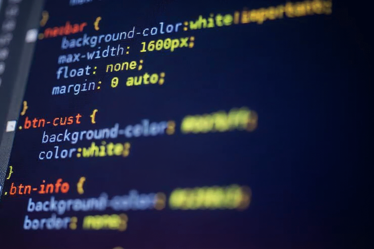
Responsive design isn’t just a “nice-to-have” anymore – it’s the foundation of modern web experiences. Whether you’re designing a landing page, portfolio, or dashboard UI, media queries help your layout adapt smoothly across devices.
But instead of relying on the same old breakpoints, here are five powerful CSS media queries that can completely transform your design workflow and give you more control than ever.
1. The Classic Breakpoint Query (But Smarter)
Most designers use media queries only at fixed device widths like 768px or 1024px. But modern responsive design works better with content-based breakpoints, not device-based ones.
@media (max-width: 900px) {
  .hero {
    flex-direction: column;
    text-align: center;
  }
}
Design for your content, not specific devices. Instead of targeting fixed screen sizes, adjust your layout when the content itself starts to break. This approach keeps your design flexible, future-proof, and ready to adapt smoothly to any new screen size or device that comes along.
2. Prefers-Color-Scheme (Automatic Light/Dark Mode)
Dark mode users expect websites to respect their OS preference. This media query does exactly that:
@media (prefers-color-scheme: dark) {
  body {
    background: #111;
    color: #f1f1f1;
  }
}
Why it changes your workflow:
This media query changes your workflow because you no longer need to create manual toggle buttons unless you want to offer one as an extra feature. Your interface automatically adapts to the user’s system preference, making your UI feel more modern, seamless, and native right out of the box.
3. Prefers-Reduced-Motion (Accessibility First)
Animations look great — until they don’t. For users who prefer reduced motion, this query helps you create accessible experiences:
@media (prefers-reduced-motion: reduce) {
  .animated,
  .transition {
    animation: none !important;
    transition: none !important;
  }
}
Why it matters:
It matters because it makes your site more accessible for users who are sensitive to motion, while also reducing unnecessary distractions and improving overall performance.
4. Orientation Query (Perfect for Hero Sections)
Sometimes you want a different layout for landscape vs. portrait especially on tablets and phones.
@media (orientation: landscape) {
  .hero {
    flex-direction: row;
  }
}

@media (orientation: portrait) {
  .hero {
    flex-direction: column;
  }
}
Perfect for:
This approach works especially well for Hero Sections, Product Pages, Slideshows, and other Image-Heavy Layouts where the screen’s orientation can change how the content is best displayed.
5. Hover & Pointer Queries (Touch vs. Mouse Friendly UI)
Not all devices have a precise pointer. This query helps you adjust UI interactions:
@media (hover: none) and (pointer: coarse) {
  button {
    padding: 14px 20px; /* Bigger tap targets */
  }
}
Perfect for:
This approach is perfect for mobile-first design because it adapts interactions to touch-based devices. It also improves accessibility and ensures that tap targets are comfortable and finger-friendly for users on smaller screens.
Putting It All Together
Media queries are more than tools — they shape how you think about responsive design.
When you start using:
Content-based breakpoints
System preference queries
Motion-aware design
Orientation logic
Pointer awareness
you shift from “designing for devices” to “designing for people.”
This mindset change alone can elevate your design flow and produce cleaner, smarter, and more human-centered interfaces.
Final Thoughts
You don’t need dozens of breakpoints to build a great responsive layout.
You just need the right ones.
These five CSS media queries help you work smarter, not harder -letting your designs flow naturally across screens, preferences, and user needs.

I love how you break down complex topics into something easy to understand.
I always find myself coming back to your posts when I need inspiration. Excellent work!
Thank you for your thoughtful comment. I’m happy the post gave you a fresh perspective.
You’ve changed the way I think about this topic. I appreciate your unique perspective.